Embedded Wallet Kit (EWK)
Turnkey offers a suite of react components to create embedded wallets without having to setup a backend by using Next.js server actions and associated directives. Each component uses the authIframeClient from @turnkey/sdk-react.
How to Use Turnkey EWK
To use the embedded wallet kit effectively, your project is required to:
Use Next.js 13+ with the /app directory structure to leverage server actions.
Import Turnkey's default styles in your
layout.tsxor equivalent entry point:import "@turnkey/sdk-react/styles";Set up environment variables in your
.envfile to configure API connections and optional OAuth providers.
Environment Variables:
| Variable | Description |
|---|---|
TURNKEY_API_PUBLIC_KEY | Your Turnkey API public key (required). |
TURNKEY_API_PRIVATE_KEY | Your Turnkey API private key (required). |
NEXT_PUBLIC_BASE_URL | Base URL for Turnkey API (default: https://api.turnkey.com). |
NEXT_PUBLIC_ORGANIZATION_ID | Your Turnkey organization ID (required). |
NEXT_PUBLIC_AUTH_IFRAME_URL | URL for the Turnkey authentication iframe (default: https://auth.turnkey.com). |
NEXT_PUBLIC_EXPORT_IFRAME_URL | URL for the Turnkey wallet export iframe (default: https://export.turnkey.com). |
NEXT_PUBLIC_IMPORT_IFRAME_URL | URL for the Turnkey wallet import iframe (default: https://import.turnkey.com). |
NEXT_PUBLIC_GOOGLE_CLIENT_ID | Google OAuth Client ID (required only if enabling Google login in authConfig). |
NEXT_PUBLIC_APPLE_CLIENT_ID | Apple OAuth Client ID (required only if enabling Apple login in authConfig). |
NEXT_PUBLIC_FACEBOOK_CLIENT_ID | Facebook OAuth Client ID (required only if enabling Facebook login in authConfig). |
NEXT_PUBLIC_OAUTH_REDIRECT_URI | OAuth Redirect URI (required only if enabling Google, Apple, or Facebook login, e.g., https://your-app.ngrok-free.app/). |
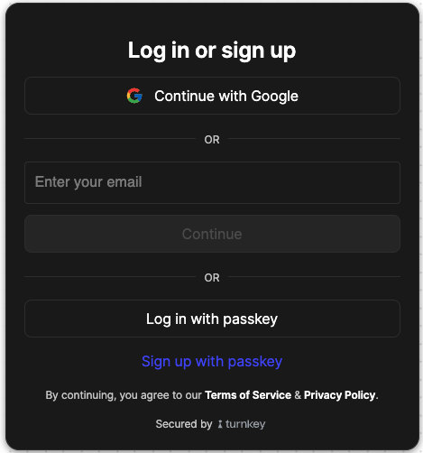
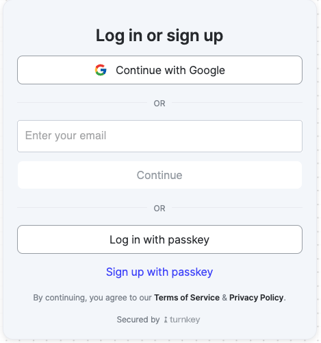
1. Authentication with the Auth Component
The Auth component provides authentication functionality, including email, passkey, phone, and social logins.
Usage Example:
import { Auth } from "@turnkey/sdk-react";
import { toast } from "sonner";

function AuthPage() {
  const handleAuthSuccess = async () => {
    console.log("Auth successful!"); // You can now use your authIframeClient to make requests!
  };

  const handleAuthError = (errorMessage: string) => {
    toast.error(errorMessage);
  };

  const authConfig = {
    emailEnabled: true,
    passkeyEnabled: true,
    phoneEnabled: false,
    googleEnabled: true,
    appleEnabled: false,
    facebookEnabled: false,
  };

  const configOrder = ["socials", "email", "phone", "passkey"];

  return (
    <Auth
      authConfig={authConfig}
      configOrder={configOrder}
      onAuthSuccess={handleAuthSuccess}
      onError={handleAuthError}
    />
  );
}

export default AuthPage;
Your component should look like the below
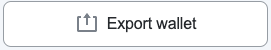
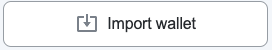
2. Importing and Exporting Wallets
The Import and Export components allow users to import or export wallets securely.
Import Wallet Example:
import { Import } from "@turnkey/sdk-react";
import { toast } from "sonner";

function ImportWallet() {
  const handleImportSuccess = async () => {
    toast.success("Wallet successfully imported!");
  };

  const handleImportError = (errorMessage: string) => {
    toast.error(errorMessage);
  };

  return (
    <Import
      onHandleImportSuccess={handleImportSuccess}
      onError={handleImportError}
    />
  );
}

export default ImportWallet;
Export Wallet Example:
import { Export } from "@turnkey/sdk-react";
import { toast } from "sonner";

function ExportWallet() {
  const walletId = "your-wallet-id";

  const handleExportSuccess = async () => {
    toast.success("Wallet successfully exported!");
  };

  const handleExportError = (errorMessage: string) => {
    toast.error(errorMessage);
  };

  return (
    <Export
      walletId={walletId}
      onHandleExportSuccess={handleExportSuccess}
      onError={handleExportError}
    />
  );
}

export default ExportWallet;
Your components should look like the below
Export
Import
3. Optional: Customizing Themes with TurnkeyThemeProvider
The TurnkeyThemeProvider allows you to apply custom styles using CSS variables. This is optional and can be used to customize Turnkey components to match your application's design.
Usage Example:
import { TurnkeyThemeProvider } from "@turnkey/sdk-react";

const customTheme = {
  "--text-primary": "#333333",
  "--button-bg": "#4c48ff",
  "--button-hover-bg": "#3b38e6",
};

export default function App() {
  return (
    <TurnkeyThemeProvider theme={customTheme}>
      <YourComponent />
    </TurnkeyThemeProvider>
  );
}
You can customize any CSS variable used by Turnkey components. For the full list of available variables, refer to the this .css file Below is an example of a dark mode theme.